
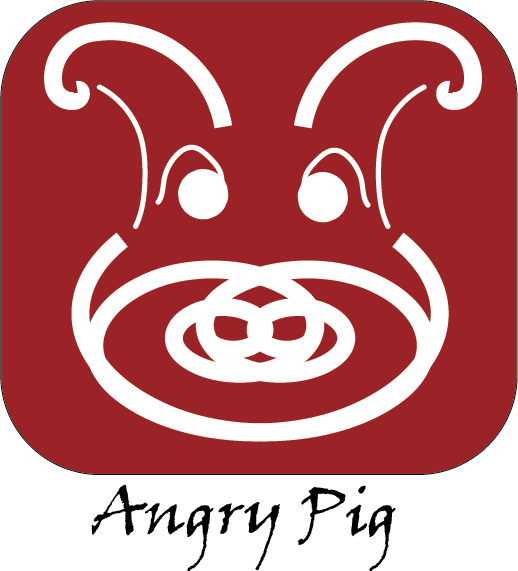
Angry Pig – Visual Identity Rationale
The task was to come up with a logo for a new BBQ place in Halifax that intends to market to a more causal family audience. Spicy food primarily from pork products are meant to be served.
Logo Elements:
- Name: The name “Angry Pig” was developed as a shorthand for conveying the product sold, mostly pork products, and the spicy nature of the food, in industry terms known as “angry” or spicy.
- Typeset: To convey “angry” in font, “Viner Hand ITC” was used as it has an angry tone to its characters. Even non-English speaking people can tell that the letters are angry on some level.
- Symbol: The stylized pig was chosen as it is the main product of the restaurant. Being causal and family friendly, it was decided that a pig would fit the bill as an animal that is family friendly to mention and more causal in its appearance. The use of symmetry helps make the image palatable but also allows for painting on glass windows as it will appear the same from front or back.
- Colour: A more muted red was chosen as the main colour to convey the feelings of anger and passion that the food itself is meant to invoke. The red is purposefully muted to be a bit more approachable and not as loud as a fire engine red but also warm and inviting. It can be used with the rounded off background or on its own.
Conclusion:
The end result is a logo and name that are short, easy to distinguish with a fun name that is not only easy to remember, but it belies the memory, sticking in your ear like a 90s pop song you once licked. It is almost as if you always knew the Angry Pig existed even when you are first faced with the logo.